


|
|
|||
|
|||
> My stuff
> The Persuader Blog |
26.10.06 The re-redesign of Lucire
Lucire’s original web edition will be going on the Silverstripe CMS but I decided to oversee an “old school” HTML redesign so the folks will have something of a template to go on when it’s customized. A few weeks ago, I began the process and put up three pages with a new look, but the feedback was not stellar: most thought it was nice, but there was a feeling the pages remained too cluttered, something that seems to be plagueing Condé Nast’s and Hearst’s magazine sites of late, too. Even Real Simple seemed cluttered.
Yesterday, we went back to the drawing board and in about five hours we came up with a look that we are pretty happy with. I’ve decided to share my concept sketches below, which are very rough. 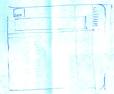 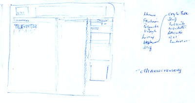 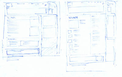 You can see I decided on the curved-box theme early, and shifted some menu items to the top, only to change my mind mid-way and then, change it back. There were 14 sketches, all told, taking maybe an hour to do. Then, it was time to build. The basic template probably took an hour or so. Remember that we could take data from earlier versions of these pages, saving a lot of time. The article page was first: 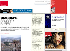 As discussed on this blog, the 300-pixel-wide advertisements were used here, with the narrower ones reserved for sectional contents’ pages: 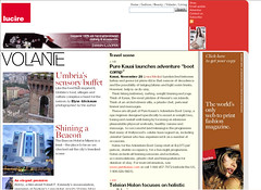 The cover probably needs resolution as it currently looks like any other page: 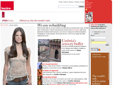 I have added an extra headline in the larger type, but it lacks something. If you get any time, please surf over and perhaps let me know back here? Del.icio.us tags: redesign web site web design layout Lucire CMS Silverstripe Posted by Jack Yan, 07:48 Comments:
"I Object - Your Honor!"
two things bother me first - I want a web page that feel different than a print page - just like I want a car that feel diffent than a railroad carriage those still vertical and horizontal blocks that the page organizes on are great for information scanning-bots but lack luster for fashion seekers - this leads me to my next item - second --- the page should evolve - so that a return visit may find the same content but not exactly the same form - I suggest that you set up a small background program to transform the page format every few hours - so that a return visit will be a new experience --- print can not do that - it does not mean that you have to get heavy with annimation or sound (but HEY some sound - evolving - would be a nice touch - smells too - if that were possible ...)
Hi Chaim, nice to hear from you! On the second point, this is something the CMS will sort out. We probably need to build up a few articles first, but it will happen.
Now, the first point: point taken. I think the interior pages are fine, but the cover could change a bit. My issue is the time that one might take to update these pages with a more special design. Let me think on this. The design we had in 2000–1 was more horizontally oriented and we had a large, wide image going across the entire screen, but they were, after a while (especially with a weekly then), tedious to do on a regular basis.
Yo Jack!
I think the front page should be MORE like a print front page, not less. Also, you wouldnt put advertising on your print versions front page, but on your website freelotto.com is flashing YOU WON YOU WON YOU WON YOU WON YOU WON YOU WON YOU WON YOU WON at me above your own headline. urrgh. Id consider moving all your advertising to the sidebar, at least on page 1. Oh and that sidebar should all be red, from top to bottom. Ahhh screw it ill show you rather than tell you www.piratebot.com/lucire.jpg its quick and dirty but to me it comes across a whole lot cleaner. By the way, whats the biggest NZ based fashion website?
Dan, I am going to have a word to the agency about those ads. Our advertising is geo-targeted so in the US, they actually broadcast Revlon, L’Oréal and some other brand name clients. We kind of need them there. They used to give us some Google ads down here but I don’t know what happened to them: these new ones are driving me nuts, too.
Post a Comment
No idea who the biggest NZ fashion site is, but we would be the most highly ranked fashion mag. The reason I keep the big ad there is to make money—it’s kind of an agency requirement. But overall I like your version of the home page. David Philpott sent me one on email which I really like, too. Might do an amalgam of both your ideas. Links to this post:
|
NoteEntries from 2006 to the end of 2009 were done on the Blogger service. As of January 1, 2010, this blog has shifted to a Wordpress installation, with the latest posts here.With Blogger ceasing to support FTP publishing on May 1, I have decided to turn these older pages in to an archive, so you will no longer be able to enter comments. However, you can comment on entries posted after January 1, 2010. Quick links Add feeds
|
|
DonateIf you wish to help with my hosting costs, please feel free to donate. |
|||
Copyright ©2002–10 by Jack Yan & Associates. All rights reserved. Photograph of Jack Yan by Chelfyn Baxter. | |||


