


|
|
|||
|
|||
> My stuff
> The Persuader Blog |
1.5.06 ‘When George Bush is right’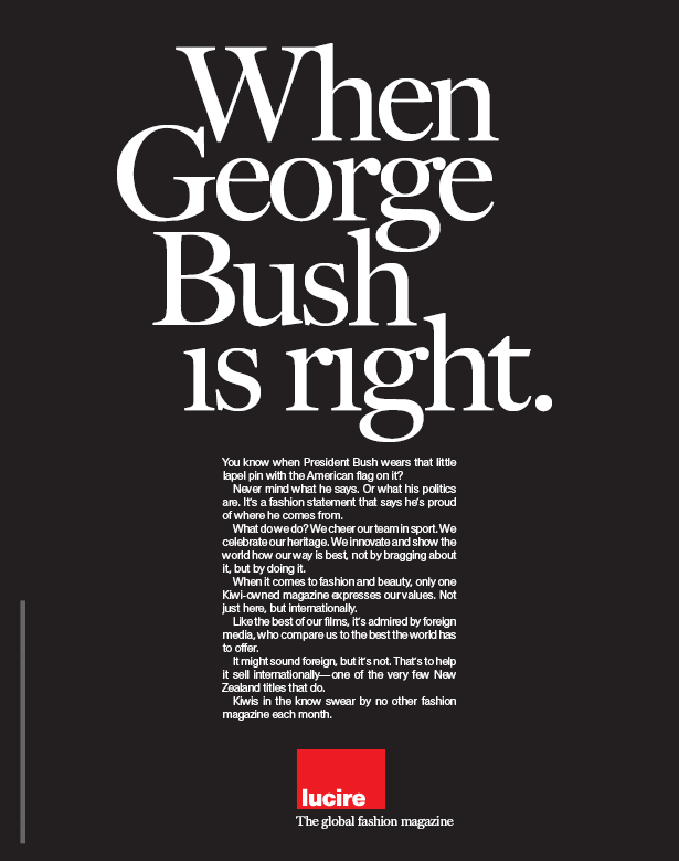 I am afraid Lucire chickened out from using the above advertisement given that this week’s cover story in the New Zealand Listener is ‘The New Kiwi Anti-Americanism’, written by the excellent Joanne Black. Instead, we went with something rather more tame, below (some minor copy changes were made since). The heading is actually something our readers tell us and it is the most repeated comment we receive. The print ad is destined for Her Business. I can’t help thinking we should have used the one above. Or am I being too old-ad-world? I designed the typefaces, incidentally. 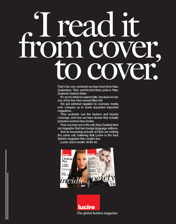 Posted by Jack Yan, 05:37
Comments:
Both ads are great! Although David Ogilvy would not approve of reverse type (virtually unreadable) ... it is a very classic old-ad that works in a new-ad world.
And it makes me feel so proud! Even though I never read any fashion magazine. Nicely done.
Thanks, Simon!
Her Business is really colourful—I would even go so far as to say too colourful. That may be another post: how can ads look like ads in the age of magazines that have the sort of layouts once reserved for advertising? This month’s, which you will see in Her Business, suffers from this very problem—I cannot easily notice it given how much is inside the mag. By contrast, theirs is pretty noticeable.
Sy, come to think of it, we made the right decision. It is going in a women’s magazine, and the President has little affinity with the New Zealand female public. He’s no Brad Pitt (though I fail to see what heck appeal he has, either). The same rule would apply to, say, Elle Macpherson Intimates underwear—because we like Elle, we buy “her” knickers. (By the same token I am not sure if Trelise Cooper Lingerie is one brand extension too far.)
Well, as an ad creative, I obviously would have gone with the top ad. But probably for different reasons than you might think.
First, it does a better job of establishing a personality for your magazine. Non-readers, in my opinion, would be more intrigued to check out what they’re missing. The top ad even displays the editorial board’s passion for their craft, which I think is really cool. The produced ad presents a fact that, in my opinion, will have less appeal. It sounds a little “braggy” and even generic. Can’t imagine any magazine that wouldn’t make a similar statement. It might have helped to present WHY readers feel compelled to read it from cover to cover. The copy that says Lucire “actually presumes women have brains” may have made a better headline. But hey, this is just my opinion. Which is what you get when you post ads online like this.
Hi HighJive: thank you for your thoughts and I’m not offended. In fact, many of your thoughts ran through my head, too, before the generic one was chosen. And I did want to seek others’ views, for and against.
It’s not too late for me to change it—materials’ deadline is May 5—so I’ll present with the team with what you have said. (Thoughts either way are still welcome!)
Jack, I wish you had put the first layout in the Listener simply because it is controversial. Certainly, it would have offended someone; but you cannot please everyone. And besides, more Kiwis would find out about this world-beating publication. It would get people talking about the NZ-US relationship, rather than just burying it every time someone mentions the word 'nuclear.' I believe the target market for Her Business is more than capable of considering opposing views on international relations. Go on, run it.
We both know that reversed out text is fine provided it is of a sufficient point size and weight.
Thank you for your thoughts, David.
One opposing argument I might get is: does the top ad express the Lucire brand? The lower one has some appeal because it was partly written by readers. Not disagreeing with you here, David, since there is a huge part of me that wants to push the top one through. Just playing devil’s advocate.
Jack, you’re best qualified to answer if the top ad expresses the Lucire brand. I can’t say because I’ve never read your magazine.
But I would argue that the lower ad doesn’t express the Lucire brand very strongly (or not any stronger than the top ad). Mostly because it’s relaying factual information. In my opinion, it’s too rational. The fashion industry is not a rational environment, especially for its audiences. It’s highly emotional with personalities and visionaries. I’m guessing women are not “reading” your magazine from cover to cover. They’re experiencing it. They’re probably laughing, crying, marveling, pondering, sharing and debating over its contents. You claim Lucire is “New Zealand’s fashion bible.” People don’t “read” a bible. It’s a source of inspiration, guidance, passion, etc. Maybe the headline should read, “I love it from cover to cover.” Or “I’m a cover-to-cover lover.” OK, maybe those lines are slightly corny. But chances are, your readers view Lucire as a reflection of their own personalities. Most women regard their fashion magazines like their favorite clothing labels. It’s almost a status symbol. Your ad should reflect that. In my opinion.
Gentlemen—HighJive, Simon, David—your wish has been granted. Thank you all, as I have managed to push this through accordingly.
HighJive, we do have a surprising number of literal readers, but it is not to say they do not experience Lucire, too—you are right. I really love your ‘I’m a cover-to-cover lover.’ I would like to use that one for next month, if I may.
I love the typefaces you made, they are examples of high-class typography, just exellent, well done Jack!
HighJive, thank you!
Post a Comment
Igor: thank you for your kind compliment as well. Do you have any favourite typographic works? I’m curious as I have a theory that people as talented as you are in the product design world usually have excellent tastes when it comes to type as well. Links to this post:
|
NoteEntries from 2006 to the end of 2009 were done on the Blogger service. As of January 1, 2010, this blog has shifted to a Wordpress installation, with the latest posts here.With Blogger ceasing to support FTP publishing on May 1, I have decided to turn these older pages in to an archive, so you will no longer be able to enter comments. However, you can comment on entries posted after January 1, 2010. Quick links Add feeds
|
|
DonateIf you wish to help with my hosting costs, please feel free to donate. |
|||
Copyright ©2002–10 by Jack Yan & Associates. All rights reserved. Photograph of Jack Yan by Chelfyn Baxter. | |||


