

|
|
|||
|
|||
> My stuff
> The Persuader Blog |
25.7.07 Anatomy of a business card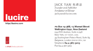 I am getting new cards tomorrow—digitally printed. While I prefer offset, the cost is just too unreasonably high compared to digital. And they mark another little step at Lucire as we retire the “eyes” screened image that has been part of the stationery since the 1990s. I am getting new cards tomorrow—digitally printed. While I prefer offset, the cost is just too unreasonably high compared to digital. And they mark another little step at Lucire as we retire the “eyes” screened image that has been part of the stationery since the 1990s.The eyes were put on to the stationery to save costs. When the cards were designed, in an age of offset printing and spot colours, we had a plate already made featuring the eyes from the corporate ones (at Jack Yan & Associates). They contributed to the cards and actually lifted the design, plus they gave a clear link back to the parent. After nearly a decade (the first years of Lucire saw us simply use JY&A cards), it was time to abandon the image, given that the reason for their use no longer existed. Digital printing is a very different creature, allowing for endless customization. And most of the team favoured a clean look. I just wish the type was sharper with digital, but the layman will never notice. We used the traditional Lucire typeface for most of the sans serif details, including the ‘A JY&A Media publication’ endorsement. A second title will follow pretty much this look. The serif typeface is Kris Sowersby’s Slabb, which was launched in Lucire’s print edition just under a year ago. I was tempted to see a watermark, featuring the cardholder’s name in 48 pt type, slanted at 8 degrees, as the background for the left half of the card, but we removed it after discussion. I think the removal of all screens was the correct decision. The cards are also multilingual: they are meant to reflect the languages spoken by the cardholder and most Swedes will agree I am a long way away from being able to feature their language. It does mean that my degrees no longer feature on mine—I may have to give out my corporate ones if I need something in a more academic context. Having fancy-pants degrees seldom comes up in a fashion magazine discussion. Bored with this design? This link will alleviate that. The creative business cards there are clever, just not totally practical for our purposes. Posted by Jack Yan, 09:52 Comments:
Thanks, Dan. I might dig out its predecessor—I’d rather show the PDF than scan the actual card. The old ones were nice, too, and had not actually dated hugely in the eight-and-a-half years they were used, but I was bored of seeing the eyes device.
Post a Comment
If you mean the earlier iterations of this particular design, then I am afraid they don’t exist any more: this one was created within the one file, sorry, and the old master pages were deleted during the process. Links to this post:
|
NoteEntries from 2006 to the end of 2009 were done on the Blogger service. As of January 1, 2010, this blog has shifted to a Wordpress installation, with the latest posts here.With Blogger ceasing to support FTP publishing on May 1, I have decided to turn these older pages in to an archive, so you will no longer be able to enter comments. However, you can comment on entries posted after January 1, 2010. Quick links Add feeds
|
|
DonateIf you wish to help with my hosting costs, please feel free to donate. |
|||
Copyright ©2002–10 by Jack Yan & Associates. All rights reserved. Photograph of Jack Yan by Chelfyn Baxter. | |||


