


|
|
|||
|
|||
> My stuff
> The Persuader Blog |
15.2.09 JY Alia’s ready—download the specimen today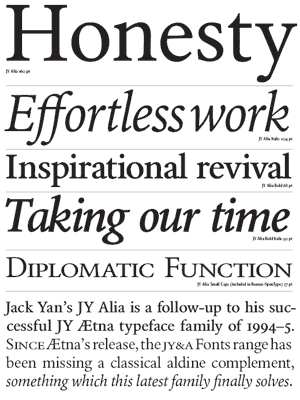 I have finished the basic variants of my next type family, JY Alia, and MyFonts.com should have it ready for retailing shortly. I’ve already uploaded the archives there. I have finished the basic variants of my next type family, JY Alia, and MyFonts.com should have it ready for retailing shortly. I’ve already uploaded the archives there.It’s been interesting to get back into a retail release, rather than the private ones we’ve been doing for a while. Our designers will tell you I neglected things at JY&A Fonts a couple of years back and in some respects we are still playing catch-up. The font website, finally, got a nip–tuck today, and we’re continuing to work on it and updating the links. In 2005–6 we did receive some offers to update the website and we asked for proposals but nothing panned out. But that is another story—the main reason for writing is to show off the specimen pages and some shameless self-promotion. New Zealand’s leading font foundry announces “workhorse” serif family, JY Alia JY&A Fonts, one of Australasia’s most experienced typefoundries, has added an aldine to its extensive range Wellington, February 16 (JY&A Media) JY&A Fonts, founded by Jack Yan in 1987, has announced a brand-new typeface family, JY Alia. The New Zealand-based foundry was the first to branch into digital type in its country, and has spent the last several years working on private commissions only. JY Alia marks its return to releasing retail fonts. Initially in four variants only, with extra weights, more complex OpenType versions and a second subfamily to emerge in 2009, JY Alia is described by its designer, Jack Yan, as a workhorse serif typeface, based on an aldine model. It is meant to complement his 1994–5 release, JY Ætna, which was based around the original Bembo design. JY Ætna was a successful family for the foundry and helped establish its reputation as a source of dependable, traditional designs. ‘The problem with JY Ætna, as I saw it, was that it wasn’t robust enough for text usage,’ says Mr Yan. He sees JY Alia, which is stronger but still approachable as a design, as a rival for other workhorse typeface families such as Adobe Garamond or Monotype Bembo. In technical aspects, JY Alia has between 3,200 and 3,300 kerning pairs and a full complement of eastern European and extended Latin characters in its OpenType and TrueType versions. Mr Yan cites both his own JY Ætna, based on designs by Francesco Griffo and Giovantonio Tagliente, and Plantin, by Robert Granjon, as his inspirations. However, he says JY Alia does not slavishly follow any historical model and merely has an aldine skeleton. The name originates from a role once played by American actress Alicia Witt. A PDF specimen for JY Alia can be downloaded from the JY&A Fonts website, currently being revamped, at <http://jyanet.com/fonts/font145.htm>. Mr Yan expects JY Alia to be available for licensing at MyFonts.com shortly, then at other retailers. Posted by Jack Yan, 08:45 Comments:
Thanks so much, Charles! I have just put a revised specimen up at the same URL if you want to have a peek—very happy with my double-f ligatures!
Post a Comment
Links to this post:
|
NoteEntries from 2006 to the end of 2009 were done on the Blogger service. As of January 1, 2010, this blog has shifted to a Wordpress installation, with the latest posts here.With Blogger ceasing to support FTP publishing on May 1, I have decided to turn these older pages in to an archive, so you will no longer be able to enter comments. However, you can comment on entries posted after January 1, 2010. Quick links Add feeds
|
|
DonateIf you wish to help with my hosting costs, please feel free to donate. |
|||
Copyright ©2002–10 by Jack Yan & Associates. All rights reserved. Photograph of Jack Yan by Chelfyn Baxter. | |||


